How To Do 3D Rendering For An Office
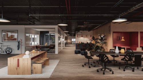
Right in the heart of Stockholm, in one of our Rotterdam office’s 3D Rendering services design, we’ve taken a step ahead for the design, innovation & working space with RONENBEKERMAN. We wanted to shape the future and make our design achieve great success with this Rotterdam office project. In this particular project, the Navy colour palette was our option of choice for the traditional and contemporary furniture and walls. Whatever we have done, we would like to share our works and project view with our readers.
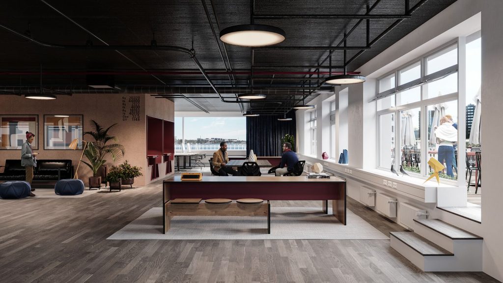
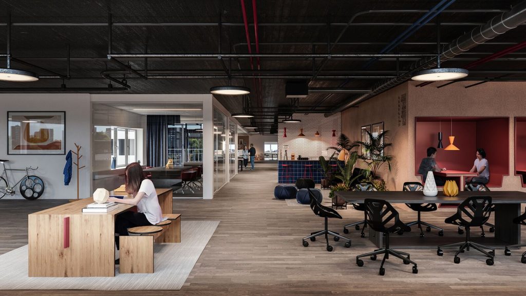
Here are the two main views of the office:
Basic 3D Rendering set up
We used Corona Render software and as you can see the set up is pretty straight forward. Almost everything is in the default set up.
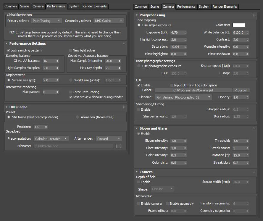
Kim_Amland_Photographic_02 LUT was our choice here because it is a great LUT scene offering great contrast and awesomely enhanced environment light.
Interior Development
Our workflow followed 6 step structures,
- We collected the materials from the client. Based on those received materials, we estimated a price for that project and created a project plan for the client to follow. We asked our clients roughly when they want the rough project plan and when we were expected to hear feedback from the client.
- According to our main Architect, we created a rough internal specification based on the client. One of the specifications is the mood board which was also consulted with the client.
- Then we started doing the 3D Rendering. When rendering, our main focus was to create the right environment and feeling based on the client’s brief. The most critical part of creating a 3D image is obviously placing the right materials in the right place and making the mood. If done all correctly, it is easy to build up the trust of the client on a first glance and avoid any unnecessary comments from the client.
- After completing the first draft, it was presented to the client and the client feedback was collected.
- The client needed some change in the draft mood and we established the change. Direct conversation with the client is a must here. It will help the client to understand what is our approach and if we make any changes according to the client, the result would be good or bad.
- The 2nd draft was given to the client and the feedback was collected. At this stage, there were some minor changes and then we delivered the FINAL result.
3D Modeling
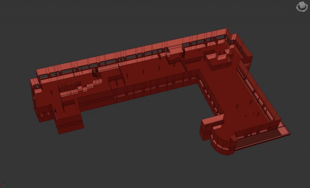
Actually, for the working place or environment, we didn’t change much to the meeting room and pods compared to the client’s requirements. Generally, we get our desired information from the structure of the 2D floor-plan. We rearrange the models according to it.
Pods, Meeting Rooms & Composition
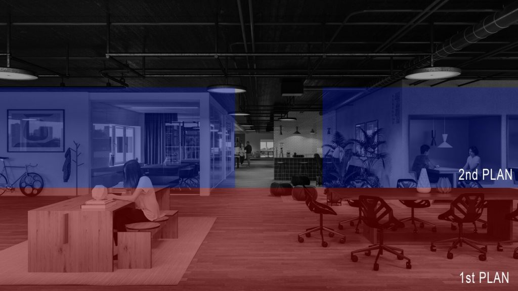
We think it is important to show our naked rendering work. Here we are showing you every single pod that was created for the meeting room of the project. You can clearly see that in the 1st plane of the image, there are only 2 working tables lying on the floor and in the 2nd plan image, you can see the whole meeting rooms with some people working on the tables with the pods.
Texturing and Materials
Flooring
Ideally, our plan for making the floor plan was to go with some of our past projects. We did make the floor with the floor generator plugin. We tried to bring Wood texture for the flooring plan from the CG source according to the client’s needs.
Being honest, for this material we did not need so many maps, in the end, it was supposed to look mostly matte, this could be simplified for sure. — Senior Architect of Walk The Room.

Ceiling
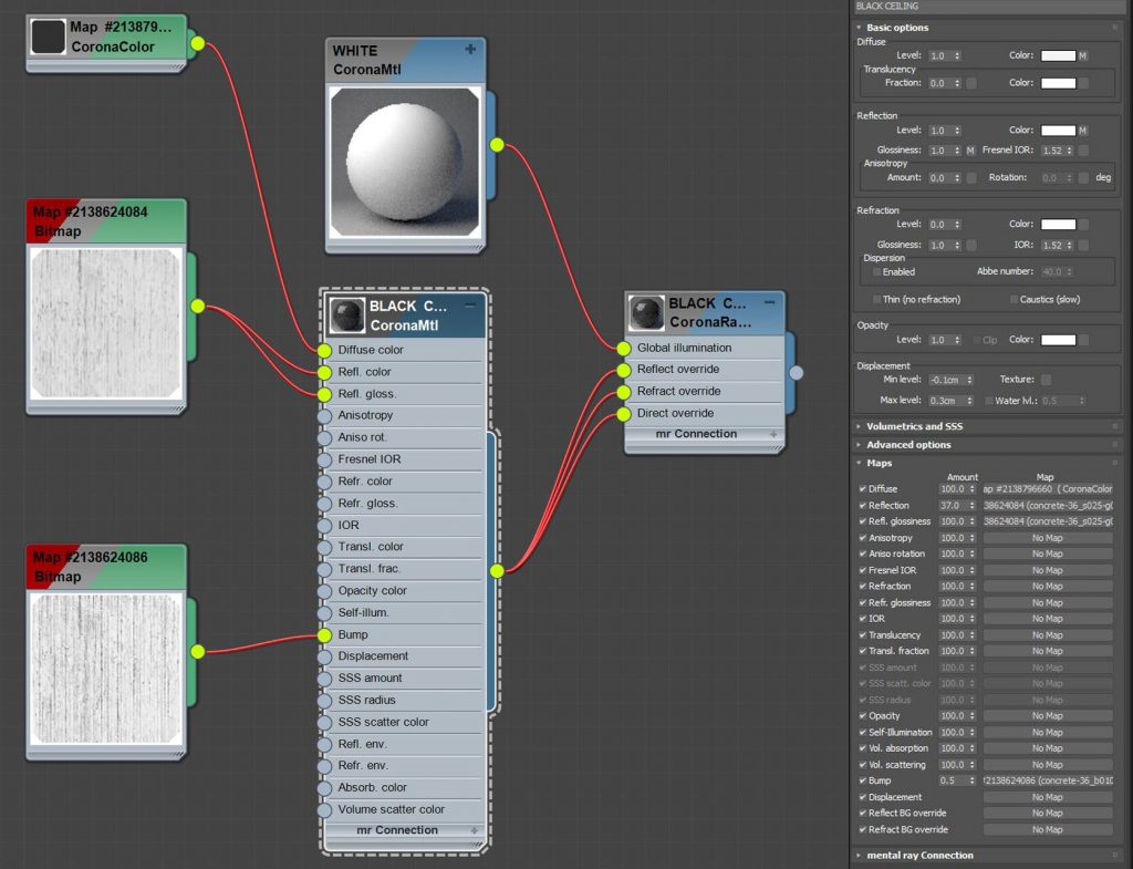
The existing ceiling was a bit dark for the past project, so we had to make it brighter. We used Corona Renderer to make the ceiling material brighter than the previous one. With Corona RaySwitch material we added some brighter materials in the global composition shot. Otherwise the scene we getting so dark.
Walls
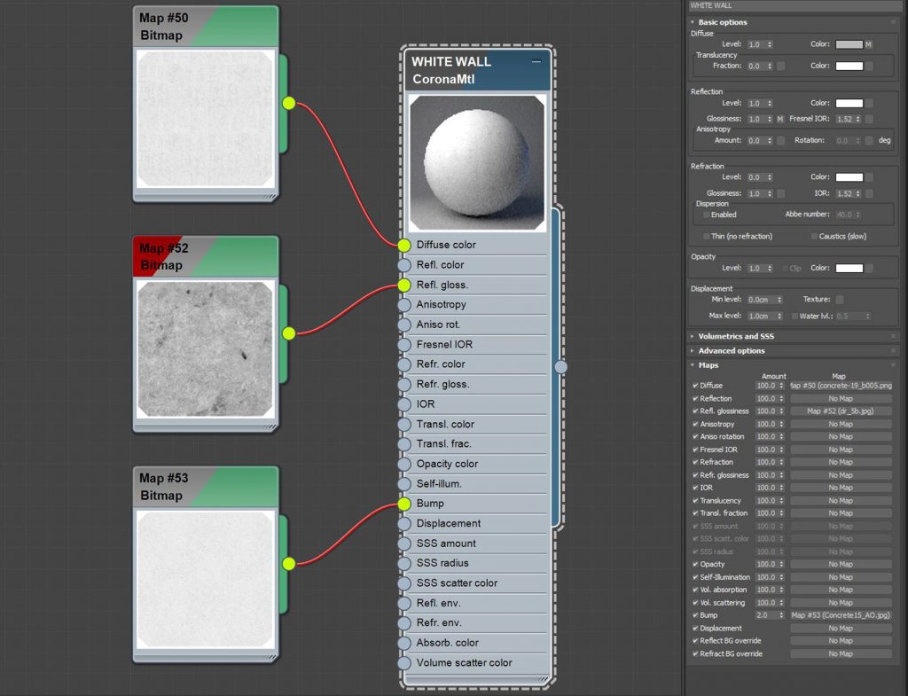
For the walls, we chose to go with pure softness on the diffuse map. We added some glossiness and bumped up the lighting in some particular areas.
Flos light
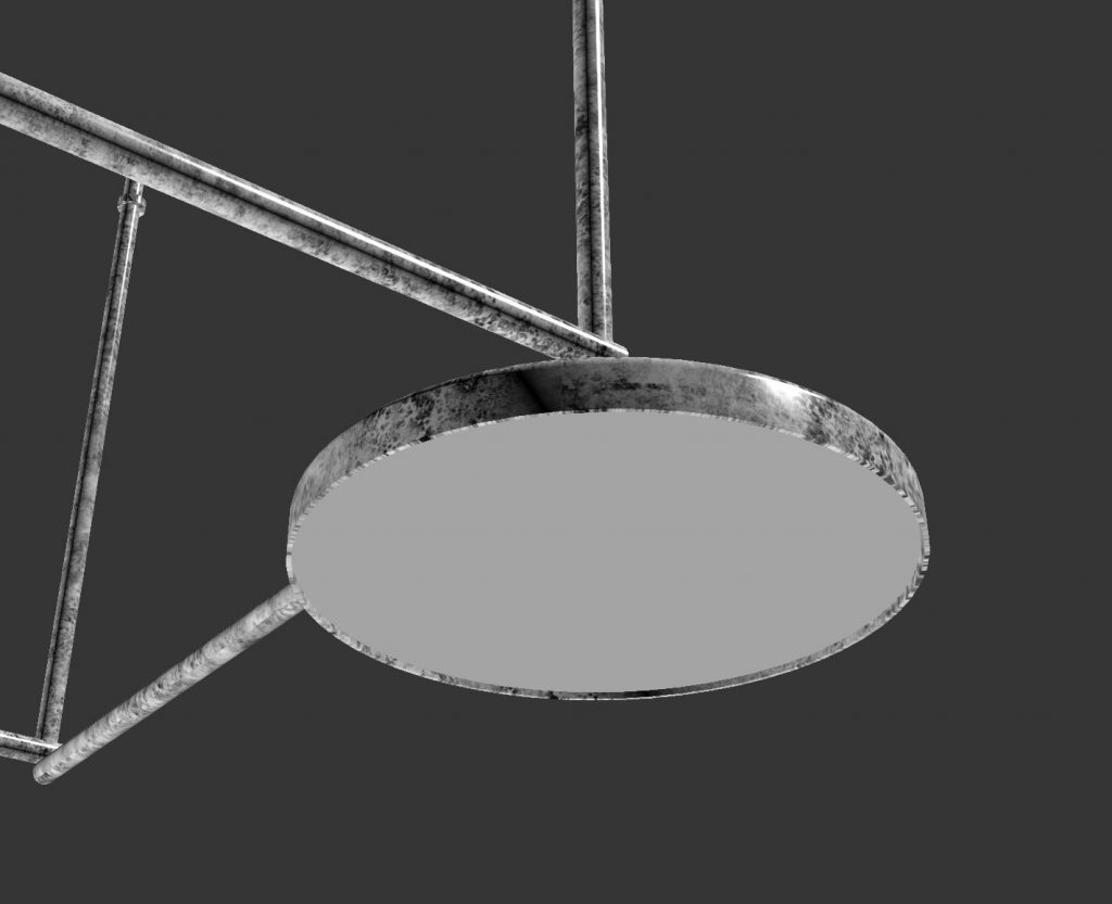
For the Flos light system, we have a nice detail work with CoronaRenderer Ambient Occlusion on the material.
Lighting
For the lighting, we have divided our works into 3 groups,
- Artificial light
- Environment light
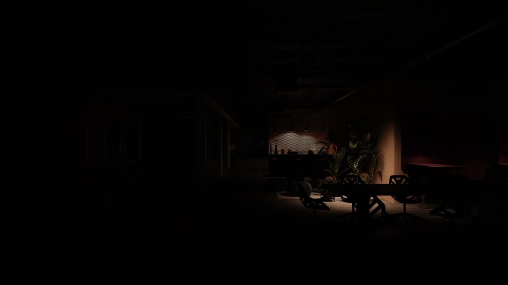
- Spotlight
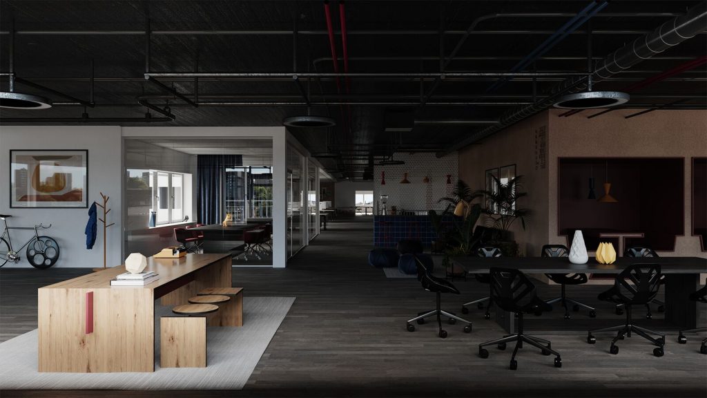
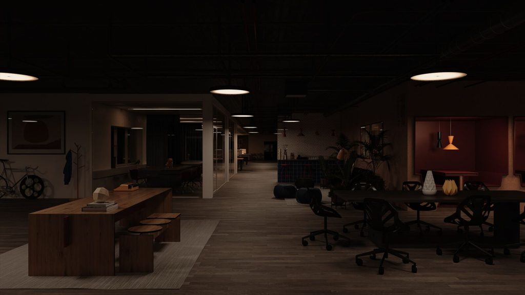
This way we had a greater chance to set good lighting for the scene and not letting it too dull or flat. After slicing the lighting work into 3 groups we had better control over the lighting situation and better knowing of what we were doing. We could play more with the light intensity and color of the lights.
We set the color temperature in the cool tone which was coming from the environment and warm tone for the artificial lighting along with the spotlight.
Environment

General light :
Spotlights :
3D Rendering
The images were fully rendered with Corona Renderer. For us, this is the best option for any 3D Rendering services type of project. With the Corona Renderer LightMix, it is easier to change some particular detail shot like some intensities and colors without setting another mood without rendering all again.
Post Production
Finally, some people were added. But when rendering, the most important part is to find the right 2D cutout that fits the people’s perspective of viewing and lighting. After that, some major and minor adjustment in levels and colors are always necessary. And that’s it! Here is the final product of our rendering,
